
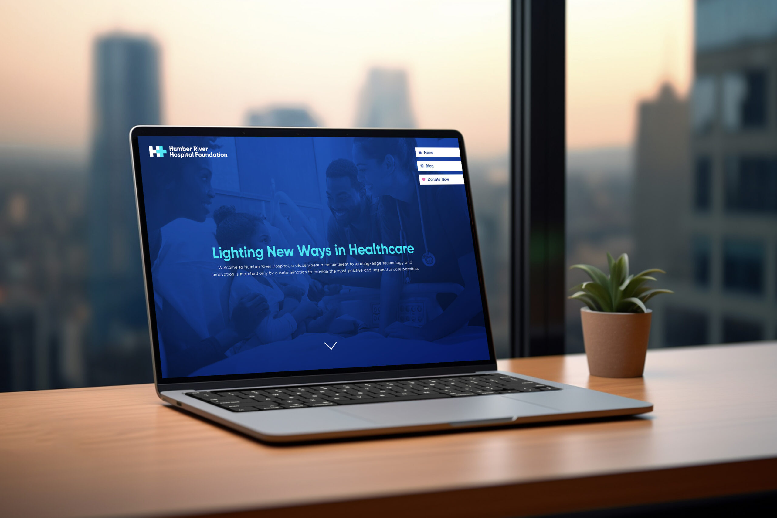
The challenge was to create a logo and look that aligned with their new tagline, ‘Lighting New Ways in Healthcare’, while keeping key elements of the foundational brand. The key elements were traditional healthcare symbols that were neither original nor ownable, so the challenge was to find a way to make the logo stand out.

I created a simple, clean logo that incorporated a blue H from the original brand but made it more ownable with the addition of an overlaid plus symbol. The plus symbol is both a traditional first aid symbol and a representation of how Humber, with its forward-thinking staff and technology, is more than your average hospital. The H and the plus became one balanced, unified icon. I maintained the brand’s original blue for the H, and added a lighter/glowing blue for the plus, to catch the eye and to represent a gentle glow, symbolic of Humber ‘Lighting New Ways in Healthcare.’


Dave Rodgers
Creative Director + Designer
Email: dave@jollyrodgers.ca
Phone: 416.723.8017
© 2024 ALL RIGHTS RESERVED