To reach a wide, national audience through large marketing campaigns, media/press coverage and high visibility partnerships, the identity had to carefully convey a serious yet positive tone, and be flexible to accommodate future growth.
Before establishing the new visual identity we employed our strategic process involving a consumer research partner, stakeholder interviews and reams of observational insights. We also performed an audit of the existing brand and the broader insurance category with a focus on direct-to-consumer.


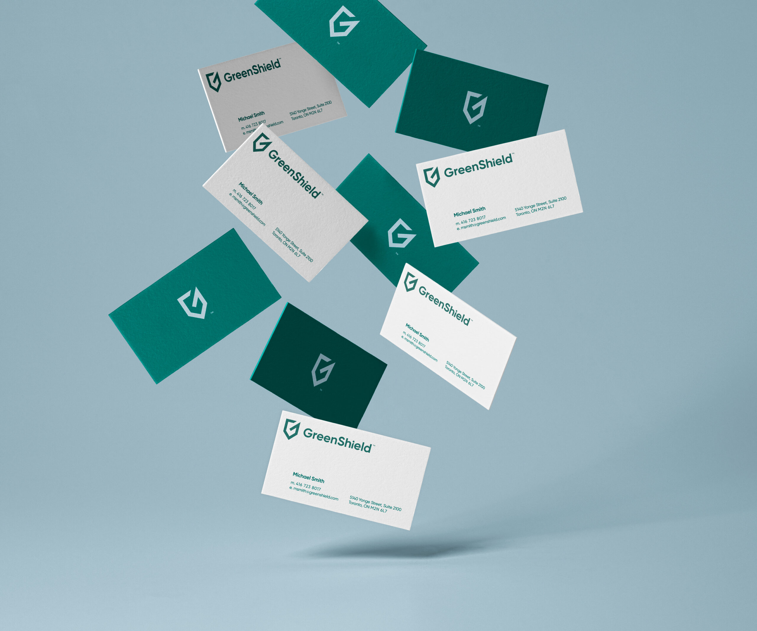
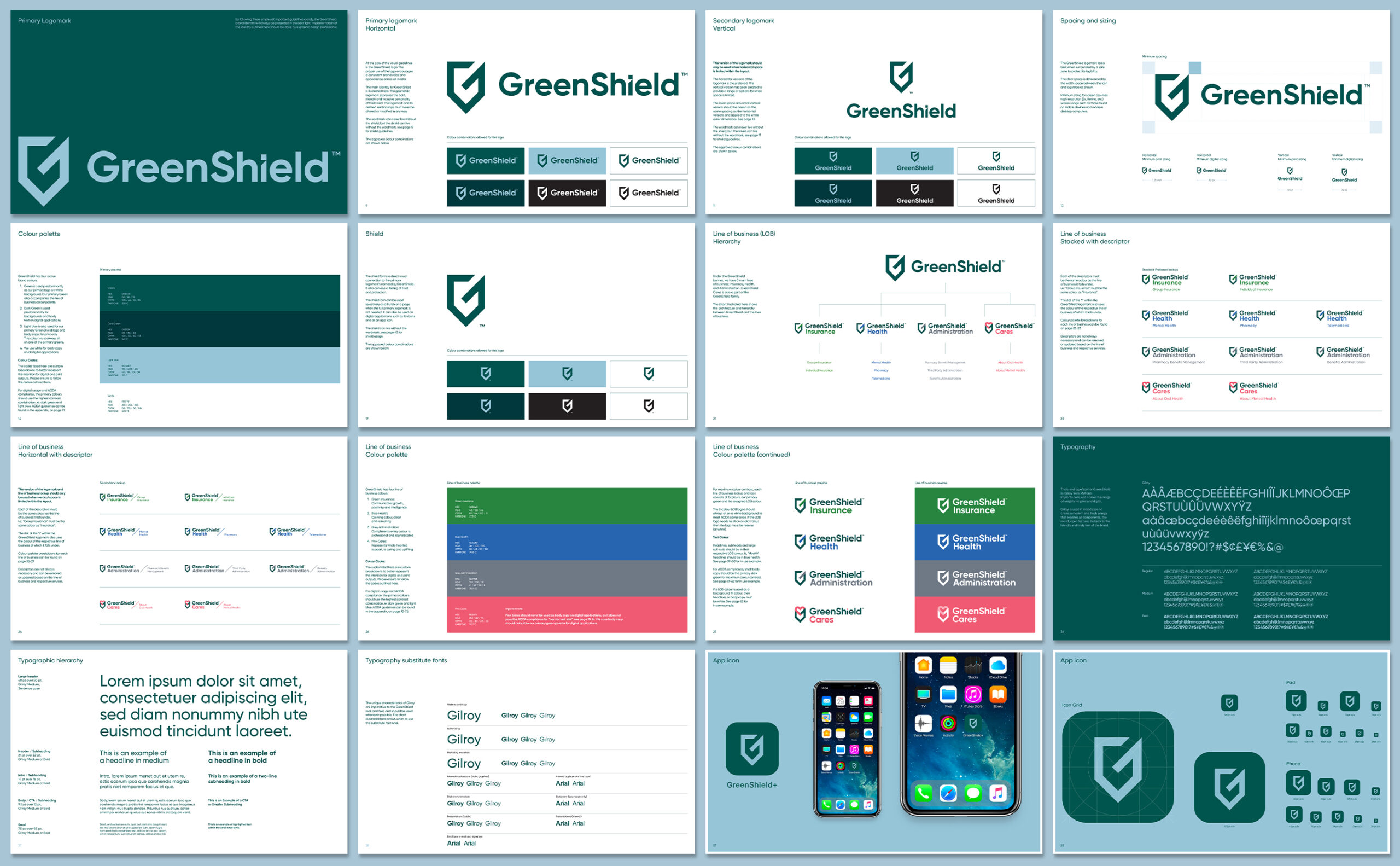
When we developed the new icon we found that featuring the 'G' would represent a strong shield of protection that functioned as a unifying element across all communications and artfully captured the essence of GreenShield. To further stand out in the market we visually positioned GreenShield with the addition of modern typography, featuring a subtle angled edge to the letter 'i' that represents an upward and positive improvement as seen on charts. This mirrors the same angle within the shield icon making it in itself a unique brand element. We made it clear from the onset that this is not the standard benefits provider.


Dave Rodgers
Creative Director + Designer
Email: dave@jollyrodgers.ca
Phone: 416.723.8017
© 2024 ALL RIGHTS RESERVED