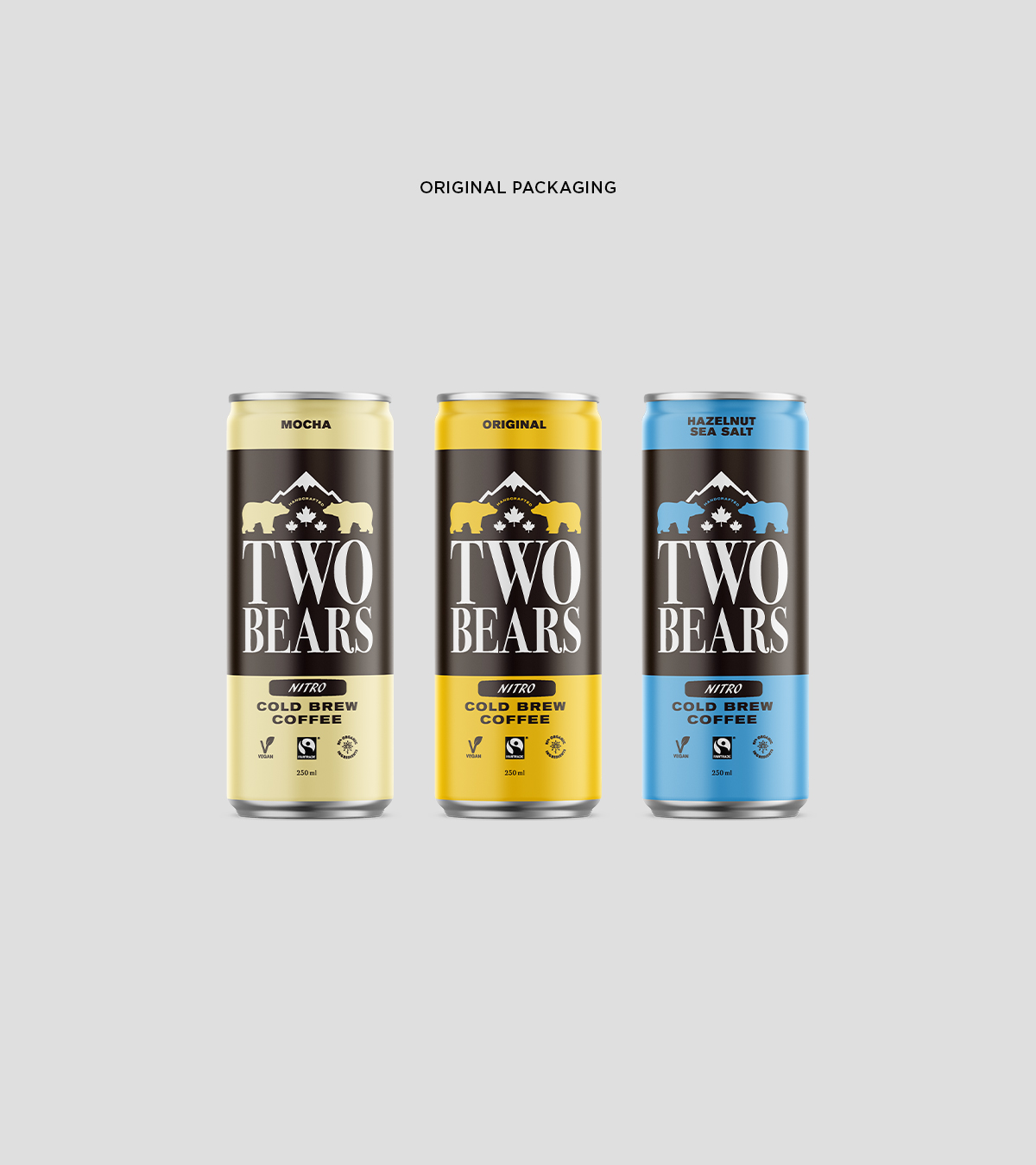
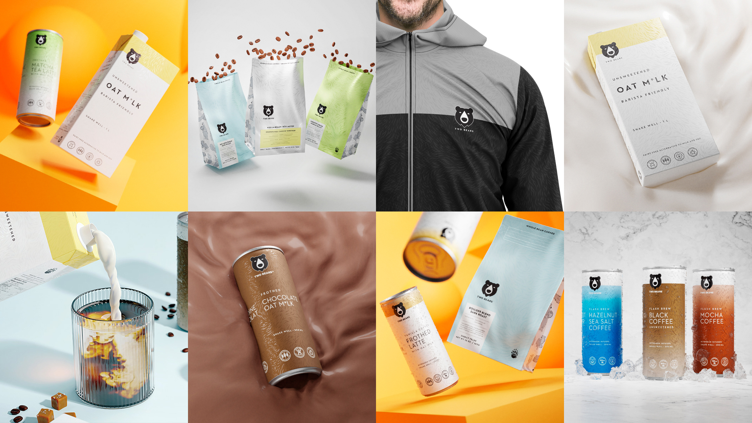
Two Bears started as a local cold brew coffee brand, that grew tremendously because of their superior product. So, to gain some respect within the marketplace, Two Bears needed a new look that competed with the other brands. We created a few options with two bears, but they all felt forced. So, we simplified it. We used a single black bear icon with a coffee drip as its nose. It was a modest nod to the product, but with a solid element of the brand.


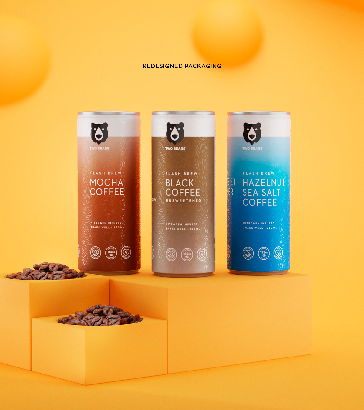
Now it was time to bring the new look into a new package design to help them stand out on the shelf. We started with a clean, minimalist design, which is typically not seen in the cold brew category. Then, we added a touch of the dramatic by using two contrasting textures. We used a spot varnish to highlight our bear fur design to really make it pop against the matte finish. What our client really loved about this design was how versatile it was: it could be stretched across a wide variety of products, from their coffee to their oat milk, and would work with any possible products in the future. We used different colours and gradients to differentiate their product line, from cold brew flavours to types of beans.
Dave Rodgers
Creative Director + Designer
Email: dave@jollyrodgers.ca
Phone: 416.723.8017
© 2024 ALL RIGHTS RESERVED